How to Make your Hero Image the Hero of your Webpage
Hero images are often the first thing your website visitors see. Make them count.
Hero images -- those large images featured immediately below a website's top navigation bar -- immediately arrests the attention of your website visitors.
Having a hero image as part of a larger, cleaner, and functional design scheme sets your website up for success. Web design remains one of the first deciding factors in a person's opinion of your company.
There are a few things to keep in mind when selecting your website's hero image:
-
Focusing on the product.
One of the most successful companies to put their products front-and-center with a hero image or hero video is Apple. Every single launch leads to a sleek presentation of the new product. They hit you with the visual first and the equally stunning and simple copy.
-
Mentioning the benefits.
Your visitors or potential customers want to know what they gain by interacting with your website. You can use a hero image to show them exactly what they'll look like by engaging with your brand, or you can use copy to tell them what about your website makes it worth their visit.
-
Directing their attention.
If you're an organization with a specific call-to-action in mind (i.e. a nonprofit wanting people to donate or a blogger wanting to boost newsletter subscriptions), one of the best things to do is add a simple form to your hero image. You'll also want to make sure your hero image is powerful enough to evoke emotion and thus action on the part of your user.
Here are a few Solodev tutorials to boost your website's success with hero images and hero banners:
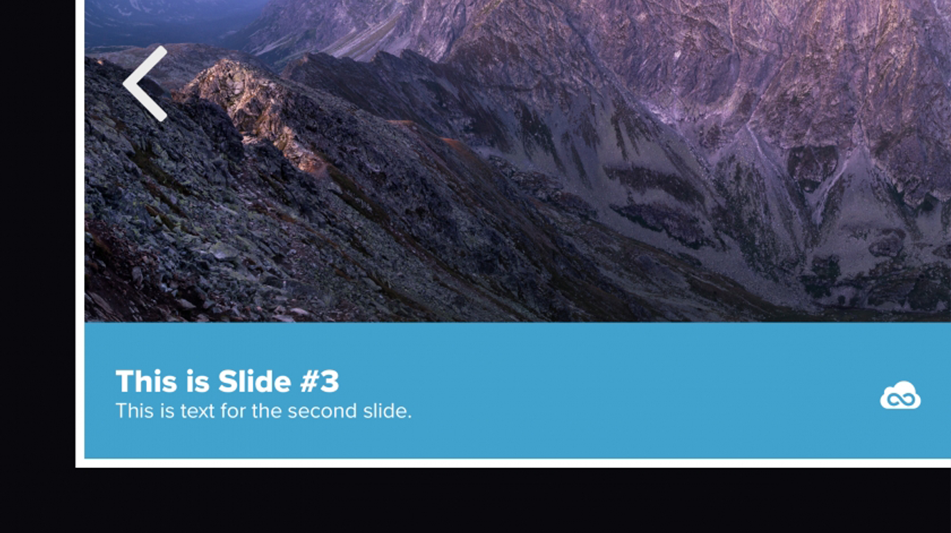
Adding a hero slider to your website
Why showcase just one hero image when you can showcase several? This standard hero slider tutorial walks you through how to add scrolling hero images to your website. The subtle movement of the slider will also keep people more engaged with your content and website, as they want to see what other images come next.
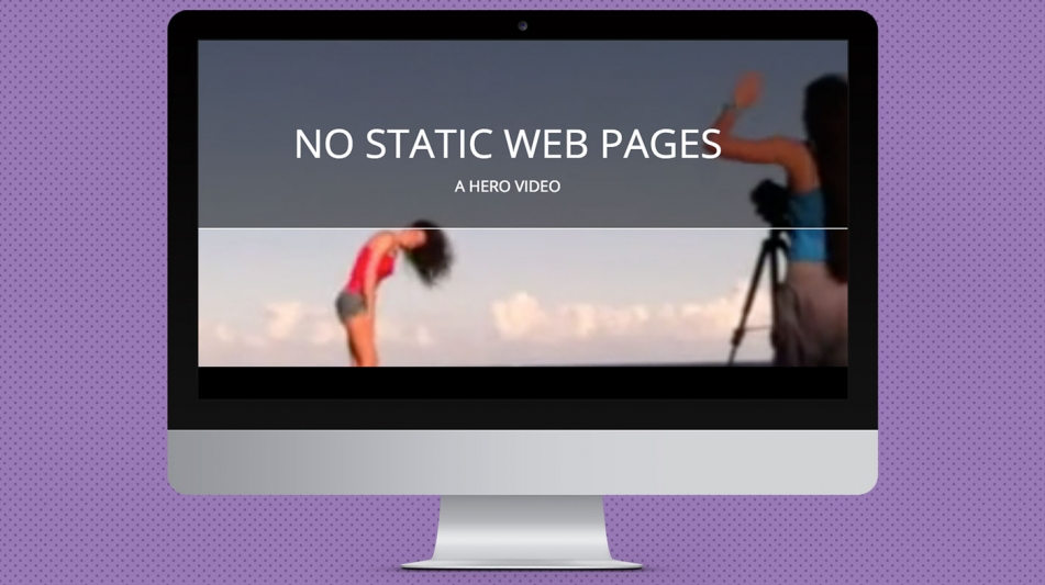
Adding a hero video to your homepage
Visual content is critical for the success of any website's design and brand initiative. Video can elevate a website's visuals while improving bounce rates and keeping people engaged with your website longer. What better place to catch someone's attention than a hero image that's actually a hero video? As an added bonus, the video gives your organization to showcase a product, service, or company voice to site visitors before they even scroll further down the page.
Creating a hero with a featured video
Sometimes, autoplaying a video just doesn't work for your business. That's why we created this tutorial on how to embed a YouTube video in the spot of a hero banner. It requires the user to activate the video rather than autoplaying on a loop like the tutorial above.
Adding text transitions to hero sliders
Text on hero images punctuate your visual element with important -- and SEO-friendly -- keywords about your company. This tutorial teaches you how to spice up static hero images with a bit of animated text.
Building a hero slider in pure javascript
Most sliders on the web require third-party jQuery plugins to work. This tutorial bypasses that and teaches you how to build out an animated slider using only JavaScript.
Crafting a hero slider with sliderPro.js
This is another alternative to the standard jQuery plugin. Sure, it's still a jQuery plugin, but it's quickly becoming one of the best ones on the web. It allows for touch-swipe, text thumbnails, slide loops and animated layers. sliderPro is definitely one of our favorite jQuery sliders available for hero images.
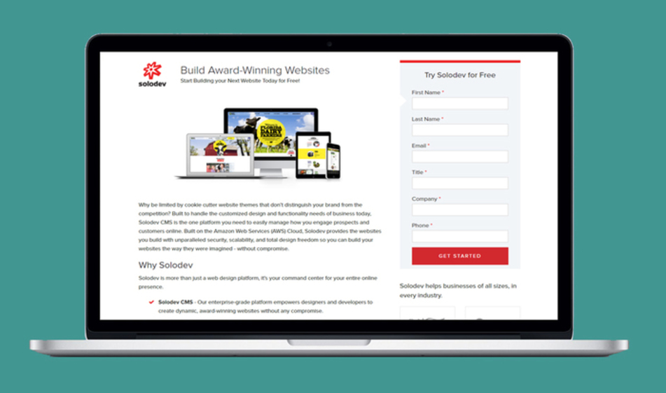
Adding a form to your hero image
Since hero images are excellent at catching and holding your visitors' attentions, it's the perfect design element to pull "double duty." A hero image's key focal location can help direct a website user's directional flow. One of our favorite double applications of the hero image is by using it as a form. For optimal success, make sure the form is short, sweet, and the CTA is to the point.


