How to Design Pricing Boxes that Get People to Click
Pricing pages are the 'final frontier' in getting people to land on your product. Use this simple CSS to seal the deal rather than scare them away from your business.
There’s a ton of information floating around about the ‘perfect landing page,’ but don’t forget about your website’s most important page -- the pricing page! Design can boost your pricing strategy by a few visual tricks and simple CSS. And while this tutorial isn’t a one-size-fits-all solution, it can definitely help boost your click through rate and (hopefully) your bottom line!
Before you even get into the CSS of the design, you should already have this information solidified:
- An understanding of your profit maximizing plan. Which featured pricepoint does in fact offer the best return for your company while also appealing to the most number of potential buyers? You might have to A/B test two particular plans to determine exactly which one is the best.
- How you’ll put your most appealing price points in the middle of the page. Web users naturally look to the middle of a webpage first in order to quickly take in what’s above the fold before reading the content from left to right.
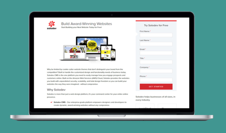
- What copy you’ll use to make distinctions between pricing while also using similar copy. For example, the Solodev pricing page gives each price package a “character” as a distinctive marker, but other than that, it keeps the copy relatively similar in tone and style.
And as you design and test these pages, keep these tips in mind while you go:
- If you’re promoting something as your “most popular” item, make sure it is in fact the most frequently bought item. This will save you from potentially running into claims of false advertisement.
- Make it as easy as possible for clients to compare plans, and keep the overall look simple. Tables are a reliable visual element that helps a potential buyer quickly compare benefits to each pricepoint given their needs.
- Don’t forget your call to action button! You can test different CTA copy from more traditional ideas like “Add to Cart” or “Buy Now” to branded copy like “Blast Off,” “Let’s Go,” “Get Started.” Just remember that high-performing CTAs often reflect the copy and branding tone found elsewhere on the pricing page.
- Keep all of your pricing boxes above the fold. If a visitor has to scroll to uncover your pricing plans, they might feel like you’re trying to trick them into your ‘good deal’ by not being upfront. There’s also the chance that a user simply bounces from the page entirely; they clicked on what they expected to be a pricing page, but they’ll quickly leave if they don’t actually see any prices.
- Stick to just pricing on a pricing page. It’s tempting to add in another type of form along the siderail or below the fold, but that’s just another CTA that could distract your visitor from following through to purchase your product. It might also add more sales pressure than your website visitor wants. They just came to your pricing page to find the best value, not download your entire library of e-books in the process. If you add anything else to your pricing page, it should be 1) below the fold and 2) address any fears/doubts/misunderstandings your client could have. For example, on our own pricing page, we’ve put an FAQ to directly answer any last-minute questions someone has about the product before purchasing.
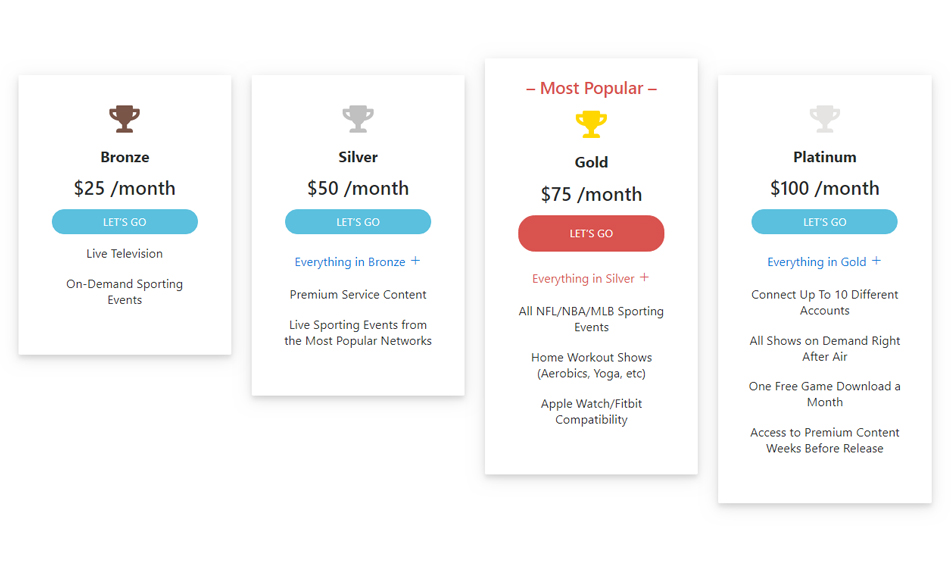
You’ve nailed down your ideal pricing plans, now here’s simple CSS to use that showcases your hard work and ultimately gets people to buy your product:
HTML
The HTML relies heavily on some standard bootstrap classes, particularly for things such as padding and margins:
CSS
Just a handful of lines of CSS will create the display of the section, including the soft border-radius and the highlighted option feature:
All together, the HTML and CSS work with another to create a visually appealing display for your end user. Customize everything to fit the individual needs of your organization.

