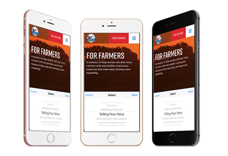
Converting Horizontal Navigation into Mobile Dropdown Menus
Responsive navigation doesn't have to be so tricky. Here's how to convert your horizontal navigation into a sleek mobile dropdown menu.
As a web designer, you know mobile responsiveness is key for any website's survival. There's over a 50 percent chance that someone came to your website from a mobile device rather than a tradtional desktop computer.
However, "mobile responsive design" is sometimes easier said than done. One of the biggest tricks to successful mobile design is ensuring that your navigation remains functional and user-friendly even if the design changes. Providing alternative means of navigation (especially within certain subsections) gets tricky on mobile design. By converting menu lists to a dropdown on mobile, you can better preserve your overall design.
HTML
Our HTML contains one navigation for desktop and a select dropdown for a great user interface on mobile.
CSS
We use CSS here for perfect styling and alignment of the desktop navigation, and some custom styling on the select box.
Want to see how this functionality could look on your site before you invest the time in coding? Try it out first in the JSFiddle below! Don't forget to adjust the browser window at a variety of sizes to see exactly how the website responds in mobile format!


